
Spottr: An AI mobile app that prepared and supported gym beginner from day one
CATEGORY
Product Design
TIMELINE
6 Weeks
INDUSTRY
Health & Wellness
TOOLS
Figma, Claude Code, Video Editing, UX Research
💬 Project Overview
🌱 Problem & Opportunity
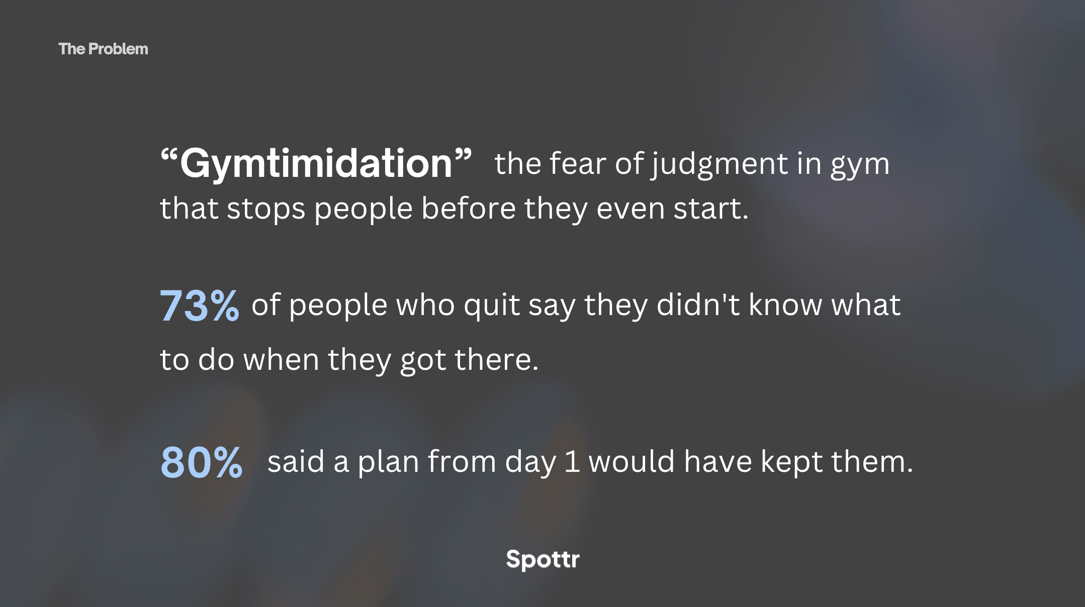
60% of gym members quit within 6 months. Not because they lack access to equipment, but because the barrier is emotional, not informational.
⚡️ Challenges:
Beginners arrive with no plan, no guidance, and immediate intimidation: over 70% of people avoid the gym due to fear of judgment. 73% of people who quit said they didn’t know what to do when they got there. 80% of them also said a plan from day 1 would have kept them going.
No existing app handles a missed week with grace: all punish inconsistency, creating shame spirals that block re-entry
Users patch together 3–4 apps (ChatGPT, TikTok, Instagram Reels) just to feel confident enough to start a session
Personal trainers solve the emotional problem, but at $300–400/month they're inaccessible to most
The opportunity was to occupy the gap between structured enough to replace a trainer's guidance, affordable enough to be accessible, and emotionally intelligent enough to handle the human moments that make or break month 1.
👩🏻💻 My Role
I worked as UX/UI Designer on a 2-person design team, contributing across the full research-to-prototype sprint.
Responsibilities:
Conducted and synthesised qualitative user research (interviews, survey n=38, affinity mapping)
Designed wireframes and hi-fi screens across 5 core product flows
Owned the Onboarding + Grace Re-Entry flows end-to-end
Vibe coded all 20 screens into a live, navigable prototype using React + Vite, deployed on Vercel
Collaborated on competitive analysis (16 products benchmarked)
Contributed to pitch narrative, presentation design, and demo video


🏆 Project Scope / MVP
The prototype covered 20 screens across 4 flows, each designed around a specific emotional moment in the user's journey, and every screen was built and live on a real URL by pitch day.
Flow 1: Onboarding & Plan Generation Goal-first conversation ("What are you training for?"), medical/injury intake, and a complete 4-week plan delivered before the user's first session — eliminating the blank slate entirely.
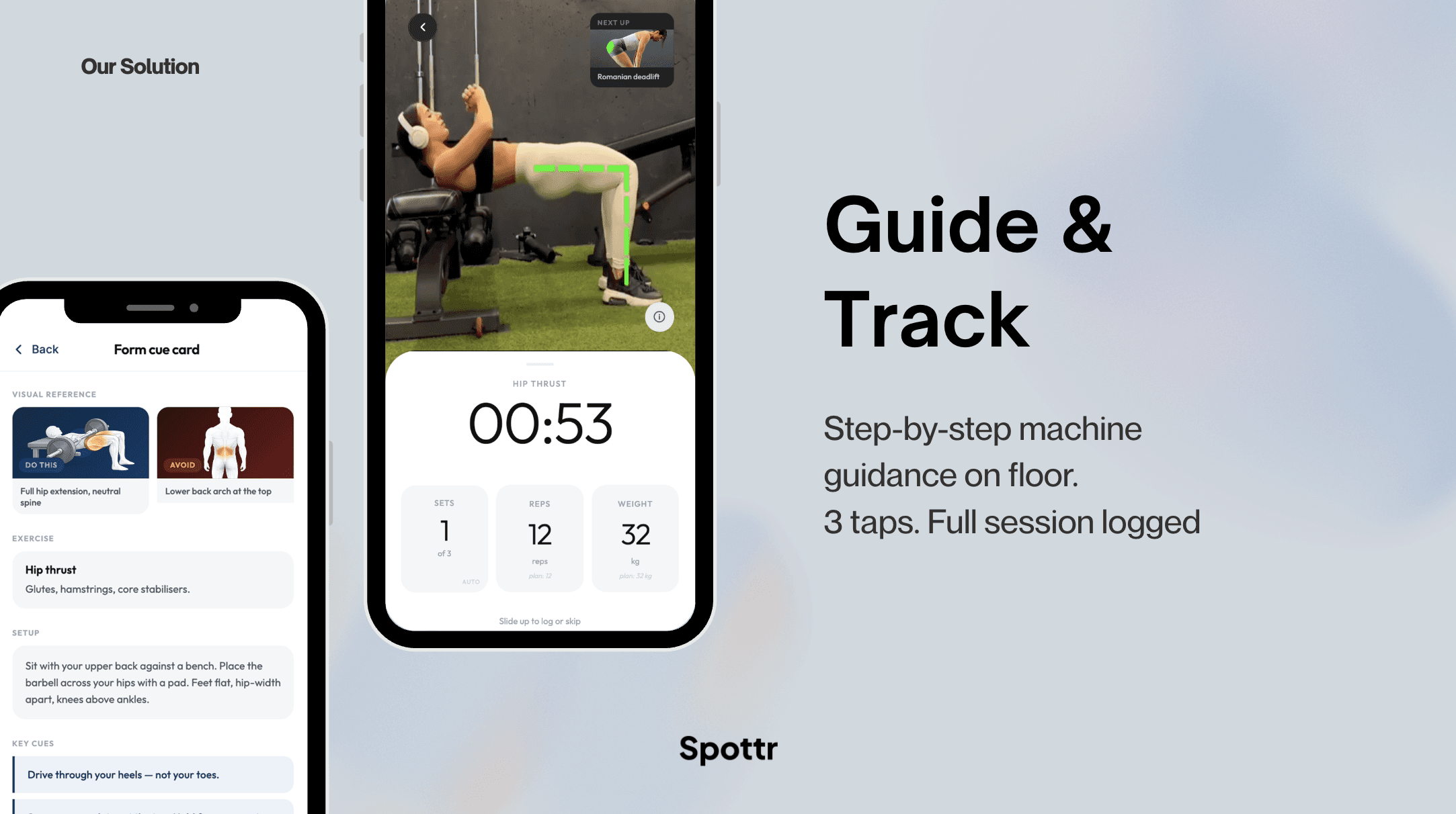
Flow 2: In-Session Logging 3-tap workout logging with pre-filled sets, reps, and weight. Rest timer that auto-starts after each set, replicating the trainer's "60 seconds — let's go" presence. In-app form library so users can look up exercises without the shame of Googling mid-session.
Flow 3: Monthly Wrapped A Spotify Wrapped-style milestone celebration: sessions completed, PRs hit, total volume lifted. Designed to be shareable and emotionally resonant — the hero moment of the product and the centrepiece of the pitch demo.
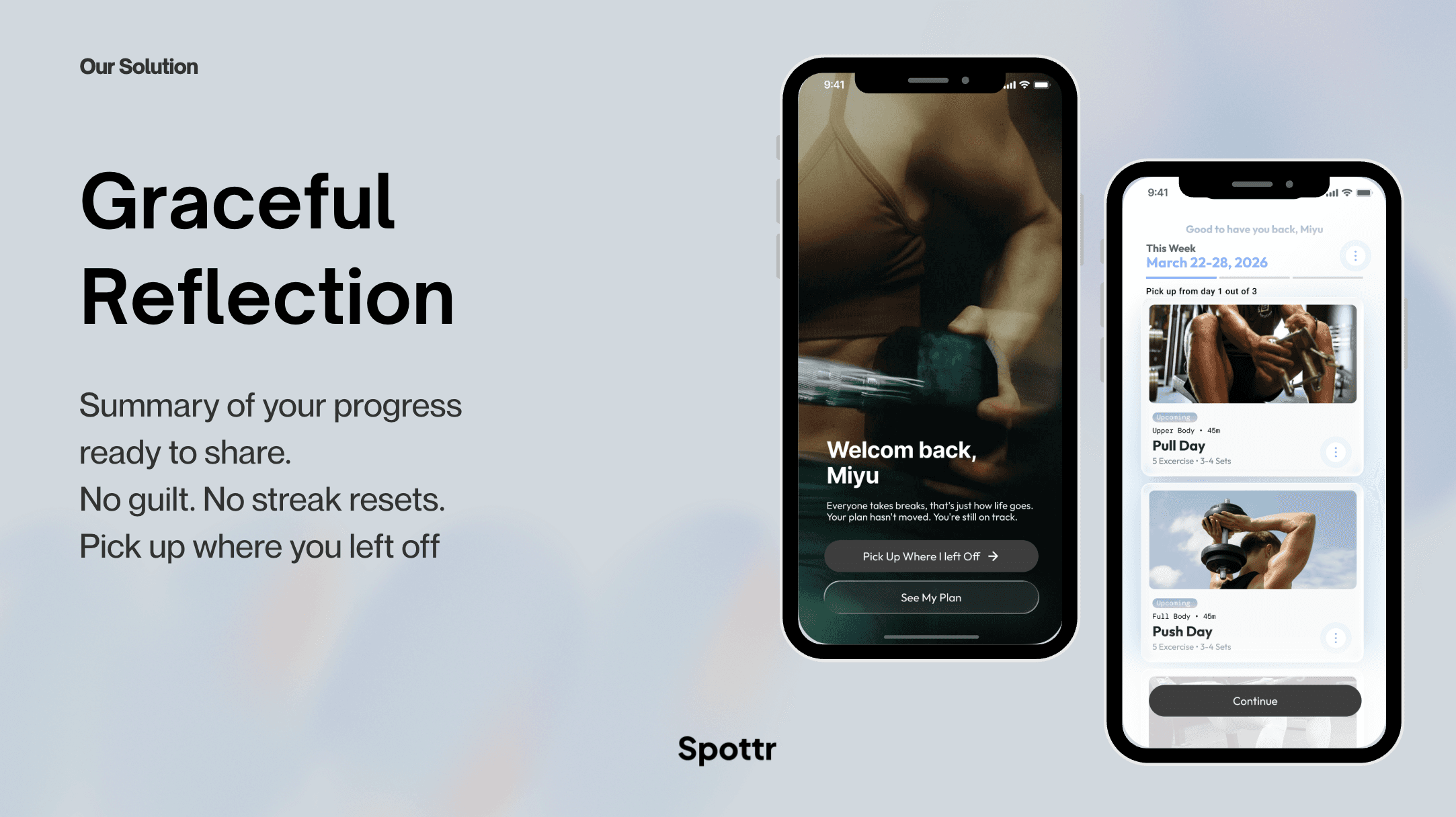
Flow 4: Grace Re-Entry The product's most differentiating screen. When a user returns after a lapse, instead of a broken streak or silence, they see: "It's been 9 days. Life happens. You're here now, that counts." No guilt. No penalty. Forward only.
🎯 Our Solution
Emotional design as architecture, not a feature Every screen was designed around the emotional state of the user, not just the functional task. The core thesis: gym dropout is an emotional design problem, not a motivation or information problem.
Competence before motivation Research across all 4 interviews confirmed that motivation follows competence — not the other way round. Most fitness apps lead with streaks and badges. Spottr leads with a complete plan and form guidance that makes users feel capable first.
The "confirm, don't create" principle Every tracking interaction was designed so the user confirms pre-filled information rather than creating it from scratch. 3-tap logging. Pre-built plans. Automatic rest timers. Cognitive load removed before they open the app.
Grace as a retention mechanic The grace re-entry UX isn't just a kind tone — it's a product strategy. Validated by research: the 5 words a trainer said to one of our interview participants ("That's ok. At least you went. That counts.") broke a shame spiral before it became a dropout. The product says the same thing.
⭐️ Outcome & Impact
Delivered a fully coded, live prototype across 20 screens and 4 complete user flows, navigable on any device in a 6-week sprint
Presented at Build-a-Thon 2025 (Health & Wellness Track) to strong audience reception, with the final presentation and demo video standing out as highlights of the event
Research foundation: 4 in-depth interviews, n=38 survey, 16 competitors benchmarked, affinity map, opportunity solution tree, and assumption mapping
100% of non-members surveyed said a pre-built plan concept would change their decision to join a gym
Play out the prototype here!
💡 Key Learnings
This project pushed me to design for emotional states, not just user tasks but a fundamentally different approach to most product work. The biggest shift was learning that the most important design decisions weren't layout or interaction patterns, but copy. Five words of grace UX outperform any re-engagement algorithm. Getting that right required deeply understanding the user's emotional experience, not just their functional needs.
This was also my first time vibe coding, and the learning curve was real. It wasn't just about writing prompts. It was about learning how to think in prompts. How to give Claude enough context to produce exactly what I needed, how to structure requests so the output was usable on the first or second try, and how to work within the practical limits of tokens and context windows. More than once I hit those limits within the first couple of hours of a session, which taught me quickly that how you start a session matters as much as what you ask for.
That's something I'm actively taking forward. I want to get better at writing prompts that are more sustainable. Structuring work in a way that doesn't burn through context unnecessarily, being more deliberate about what I hand to AI versus what I keep for myself, and building a personal system for vibe coding that holds up over a full day of work, not just the first sprint.
I genuinely think this is going to be one of the most important tools for designers in the next few years. This project was just the beginning for me!


