Abstrakt: Immersive VR Experience of Berlin's Holocaust Memorial
CATEGORY
Interactive
TIMELINE
3 months
INDUSTRY
EdTech/XR
TOOLS
Figma, Adobe Suite, Miro, Unity
💬 Project Overview
🌱 Problem & Opportunity
Holocaust education is failing the next generation, and the gap is widening.
Two-thirds of American youth don't know that Auschwitz was a concentration camp. 22% have never heard of the Holocaust at all.
Traditional classroom education isn't reaching Gen Z. This generation engages through technology, interaction, and personal narrative, not passive reading. As survivors pass on and Neo-Nazism resurges globally, the stakes of this design problem are profound.
The challenge wasn't simply about delivering information. It was about building genuine empathy. Making history feel personal, human, and urgent for someone who has never encountered it.
"How might we emotionally engage middle and high school students in North America to encourage them to understand Holocaust history and its significance today?"
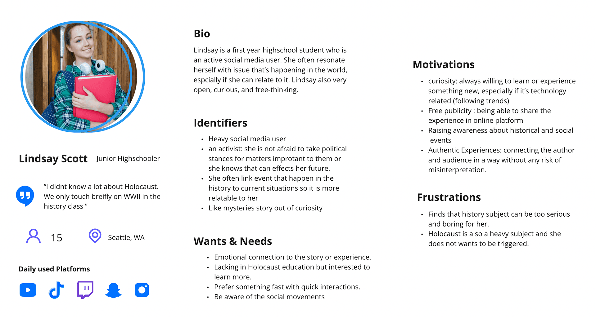
Here is our User Persona:
👩🏻💻 My Role
I was one of two UX designers on Team Flatland, working closely with Junyi Sun on interaction design while owning research, UI design, and user testing independently. While Wing managed project delivery, Kennedy handled 3D artistry, and Peter and YiZhen led development. The UX layer of how users understand, move through, and emotionally experience the space was my core ownership.
Research: Secondary research on the memorial site, Holocaust history, Generation Z behavior, and VR interaction patterns
Interaction Design: Artifact interaction ideation, categorization framework, and low-fidelity VR prototype testing with Junyi
UI Design: Tutorial guide system, interactive object icons, and visual cue language for the VR environment
User Testing: Designed, facilitated, and documented two rounds of user testing, then synthesized findings into design decisions


🏆 Project Scope / MVP
The MVP was a polished vertical slice. A focused, production-quality proof of concept scoped to validate the emotional and technical core of the experience before committing to full production.
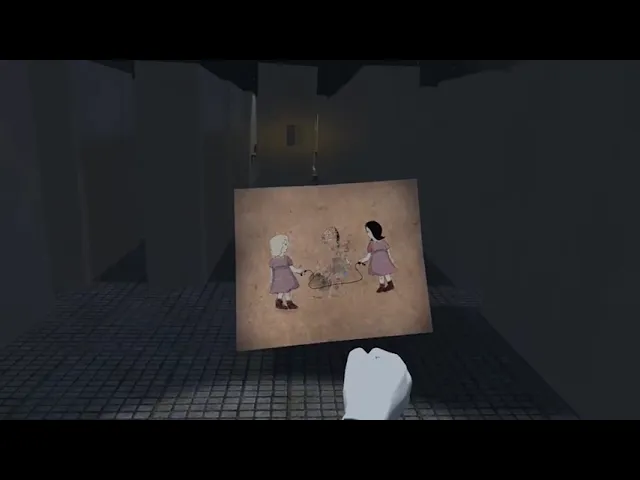
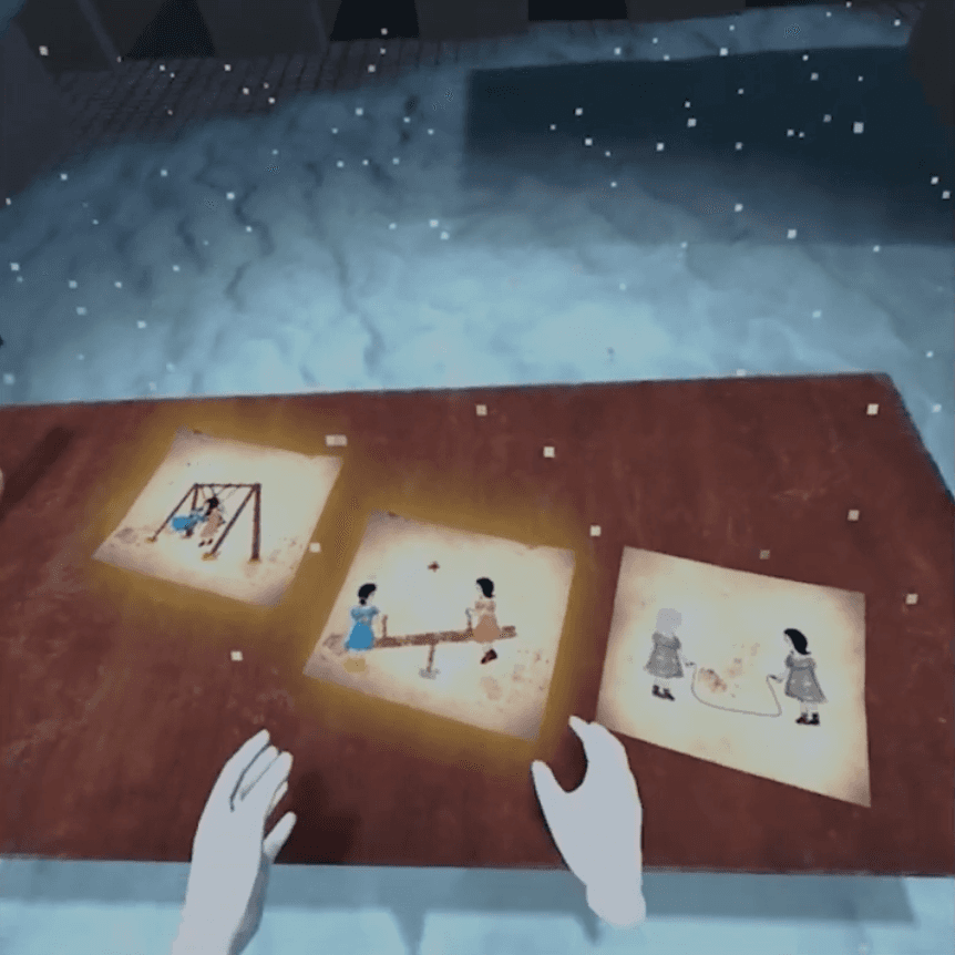
Rather than covering all of Holocaust history, the vertical slice zeroed in on one survivor's story: Hannah Gofrit. This constraint became a design strength, personalization and specificity create empathy more effectively than broad historical overviews.
The scope included:
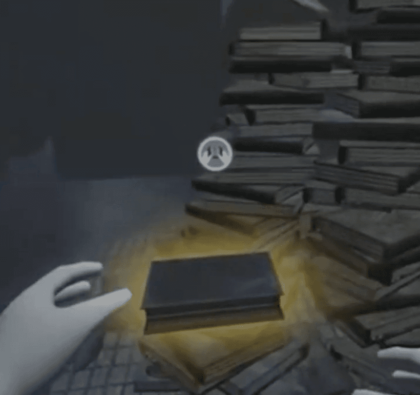
Three interactive personal artifact scenes based on Hannah's experiences
Three historical artifacts placed as optional interactions along the path
A single-button interaction mechanic accessible to first-time VR users
A visual and sound cue system to direct attention without breaking immersion
A tutorial guide and icon UI for the VR environment
Two structured rounds of user testing with documented synthesis
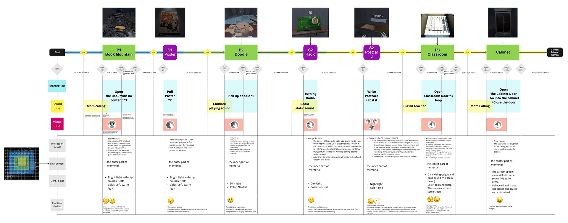
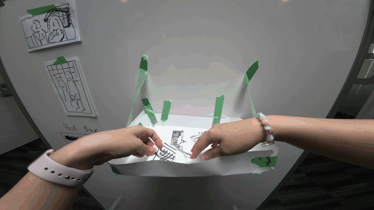
Apart from doing LOTS and lots of research, here is the example how we plan our project route and interaction before starting in the production. We created user journey and plan where the artifacts are and how we want them to feel.
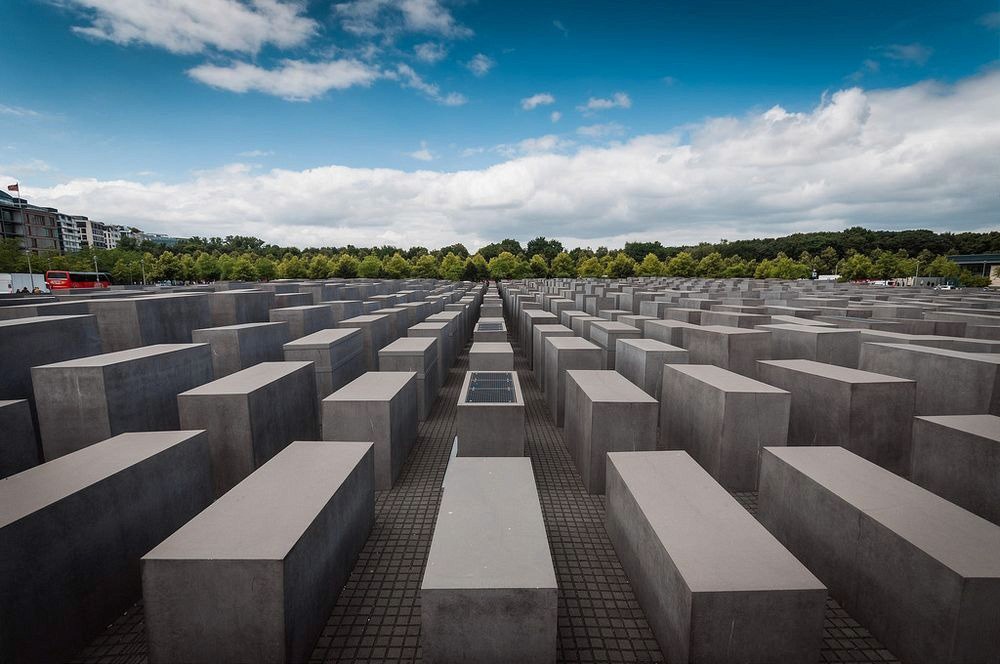
We also did a test to see how narrow it is between the wall to really feel what it's like in the memorial.
🎯 Our Solution
⭐️ Outcome & Impact
The team delivered a fully playable, polished vertical slice within the 3-month timeline which is on scope and on schedule.
User testing confirmed the intended emotional arc landed: users moved from curiosity at the opening, to disorientation and unease through the middle scenes, to genuine emotional response by the end of Hannah's story.
The artifact categorization framework. Organizing artifacts by size, shape, and material rather than individual items — gave Zeros2Heroes flexibility to swap or update specific artifacts in future development without disrupting the core interaction design. This was a key strategic deliverable that extended the project's value beyond the vertical slice itself.
The single-button interaction system was validated through low-fidelity paper prototype testing before any development work began, saving the team significant build time by catching friction points early.
Abstrakt demonstrated that immersive, empathy-driven design is a genuinely viable approach for Holocaust education with a tech-native generation which is a proof of concept that opens the door to full production.
💡 Key Learnings
Empathy workshops change the design process, not just the output. An empathy workshop led by one of Zeros2Heroes' directors early in the project fundamentally shifted how I approached the experience. From designing information delivery to designing an emotional journey. That reframe shaped every decision that followed. I now build structured empathy alignment into the start of any project involving sensitive subject matter.
Frameworks protect design intent under client pressure. By categorizing artifacts into groups rather than designing each one in isolation, I gave the client creative freedom without opening the door to cascading design revisions. When they wanted to swap a specific artifact mid-project, the category framework meant it was a contained update. I'll apply this abstraction layer on future projects where client content is likely to evolve.
Front-loading research pays back when approvals are slow. Ethical restrictions prevented us from interviewing our target audience directly. That constraint forced heavy reliance on secondary research. Which I started before client content was even confirmed. When approvals finally came through, the team could move immediately. Research done in "waiting time" is never wasted.
Stakeholders need to experience VR in a headset — not on a screen. Throughout development, stakeholders only saw recorded video in meetings. Critical spatial and emotional elements; the scale of the Book Mountain, the claustrophobia of the Classroom Loop. They simply don't translate to a flat screen. In future projects I would push for dedicated stakeholder VR sessions mid-sprint, even if it requires extra scheduling effort. The quality of feedback is worth it.
Optional interactions are a design decision, not a shortcut. Making historical artifacts optional wasn't a scope reduction. It was a deliberate choice based on how Gen Z engages with interactive experiences. They respond to exploration and agency, not forced linearity. Framing the historical artifacts as side quests increased engagement precisely because it felt like a choice. The lesson: design for your users' relationship with interaction, not just their relationship with content.


